Scratches and Spins: Engaging Teens by Improving Gamified Rewards to Drive 31% Growth in Transaction Value
End-to-end
Mobile
UI Design
User Interviews


Zywa is a digital banking app that provides teens in the UAE with their own payment cards and money management tools. Parents can send money to their teens, while teens can use their Zywa cards to make purchases, transfer funds, and receive money.
Role
Lead Product Designer
Duration
Research: 1 week
Design: 1 day
Impact
↑31% total transaction value
Skills
Product Strategy/ User Interviews/ UI Design/ User Feedback
BACKGROUND 🔍
As a team, through continuous observation of spending habits, we discovered that teens in the UAE are passionate about gaming, shopping, spending, and, unsurprisingly, free rewards!
RewardZ was our attempt to build on what worked (and didn't work) in TribeZ and make it even more engaging. We kept the spirit of gamification but added streaks and individual tasks so users didn’t have to rely on group participation.
The goal was simple: make rewards more accessible and keep teens coming back. And it worked—RewardZ found a rhythm that resonated with how our users interacted with the app.
TLDR; TribeZ📱
TribeZ was a gamified feature designed to boost engagement among teens by encouraging group spending during the summer. Users could form "tribes" to complete collective quests and level up together to earn better rewards.

SPRINT GOAL 🎯
Designing a frictionless, solo-friendly reward experience that taps into Gen Z’s love for games, boosts engagement, and increases transaction value.
THE PROBLEM 🚨
Our north star metric needed some push…
Our North Star Metric, Total Transaction Value, wasn’t hitting the mark. Looking back, the team quickly agreed when the founder said, "Okay, we know teens like games!"— a conclusion we drew from the brief success of TribeZ, one of our earlier gamified features.
Brief because TribeZ required users to form groups or 'tribes' and complete some challenges as a group. Since not all users could form or join groups we knew this was not a sustainable way to engage and retain users.
Thus, we needed to take this a step further. Users enjoyed the gamified thrill of earning rewards through spending, but we had to make sure every active user had the chance to participate in the game.
We paused to understand why the hype didn’t last.
Engagement through TribeZ spiked for about a week — but it wasn’t long before our TTV dipped again, hinting that something wasn’t quite working. To get to the root of it, we turned to the most unfiltered source of truth: teen support queries.
A lot of them mentioned not being able to join a tribe, not having enough friends to form one, or just not knowing how to connect with others to complete tasks. It became clear that while the group format gave them a taste of the reward flow, it wasn’t sustainable — group projects don’t always go as planned, especially when you’re in school. So, we spoke to a few users to dig deeper into how they felt about collaborative challenges.


A glimpse of what group quests (challenges) looked like in TribeZ.
We talked to some of our users…
We spoke to a range of users across different stages of the TribeZ experience — those who were still using it, those who never joined a tribe, and those who had stopped using it altogether.
Users who didn’t join a tribe mostly cited the reasons we expected: they didn’t have enough friends to team up with or didn’t know how to join one.
Those who stopped using it said they didn’t like relying on others’ actions to earn rewards.
The ones still using it shared that their tribe was quite active because they were already meeting up regularly to hang out, making it easier to complete tasks. However, when asked if they’d continue using it in the coming weeks, many were unsure — with school starting soon, they expected to have less time for group activities and leisure spending.

Adding chats and a community sounded great, but…
While building a community or chat feature could’ve made TribeZ more engaging—especially for finding and coordinating with tribe members—we quickly realized the technical and business constraints.
Building a reliable, real-time communication feature would’ve required significant backend support, moderation mechanisms, and development time.
Given our timelines and priorities, it just wasn’t feasible in the short run. So instead of going down that rabbit hole, we focused on designing around the problem—finding ways to deliver the same sense of excitement and engagement without needing users to coordinate externally.

We focused on what worked with TribeZ
Now that we knew what didn’t work with TribeZ, we turned our attention to what did. In those same conversations, users pointed out the parts they genuinely enjoyed: the thrill of spinning the wheel, the excitement of winning rewards, and the structured quests that felt achievable.
These elements brought a sense of fun and anticipation that made spending feel rewarding — even if the group setup wasn’t ideal. That gave us a clear direction: keep the game-like feel, but make it easier for every teen to play on their own terms.

Double-downed on the things that did work!
What stuck? The thrill of spinning, the excitement of variable rewards, and the satisfaction of completing achievable quests. These three things became the foundation of our improved version of TribeZ.
To dial up the fun, we introduced scratch cards for a more exciting reward reveal, added a leaderboard to keep it competitive, expanded our reward pool with better variety and quality across levels, and kept the quests simple enough to feel doable, yet rewarding.
…perfect time to bring in our in-app currencies!
Our app featured two in-app currencies: Zems and Zyons, with Zems being the more valuable of the two. These currencies were accumulated by users through a previous feature that the team had developed before I joined.
Seeing an opportunity to inject liquidity into the Zywa economy, we allowed users to spend their Zems and Zyons to spin for rewards. The more they spent, the better their chances of earning higher-value rewards.

THE SOLUTION 💡
So we designed a new and improved rewards feature!

We made it pop—just like a game!
We knew we weren’t just designing a feature—we were designing a feeling. For teens, the interface had to resonate instantly. A dull or overly functional design would’ve lost them at first glance. So, we leaned into what already works in their world: bold colors, dynamic visuals, and familiar game-like cues.
This wasn’t just aesthetic—it was strategic. We wanted the reward experience to feel exciting, playful, and worth coming back to, just like the games they spend hours on. By echoing the visual language of gaming, we created an environment where earning rewards felt fun, not forced.

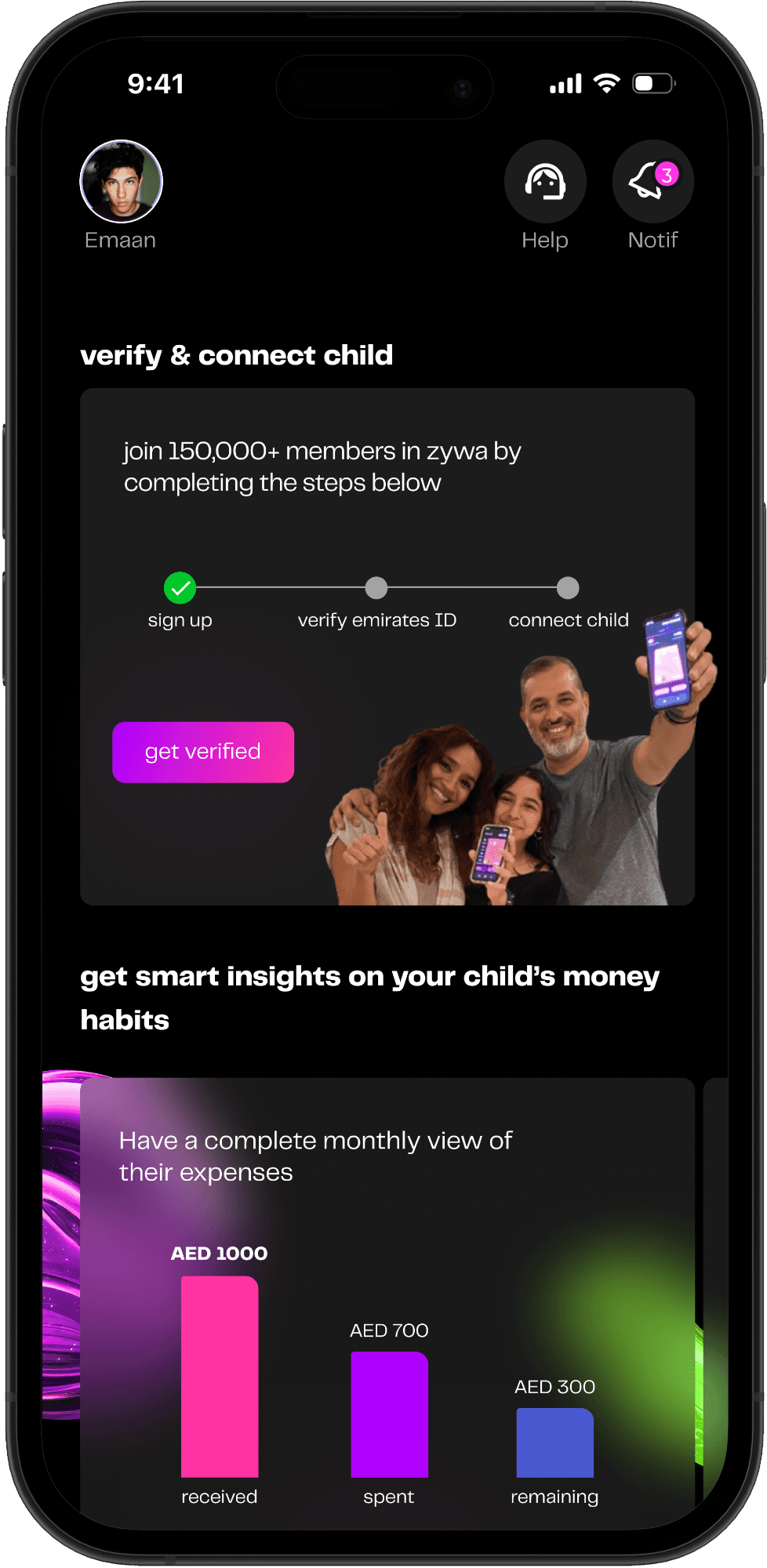
RewardZ landing screen

Homescreen banner

Leaderboard screen
We explored ways to make it more engaging!
Having worked closely with teens, we knew we needed to go the extra mile to keep them engaged with this feature.
One thing that truly resonates with them is the excitement of maintaining a streak. So, we introduced a streak mechanism, making it more rewarding for them to keep coming back and spinning for their rewards.

…and a little competitive
We also knew that a little friendly competition never hurt—especially when it comes to teens. They love seeing where they stand among their peers, and a leaderboard gave them just that.
It added a sense of achievement, encouraged repeated engagement, and gave our most active users a moment to shine. It wasn’t just about rewards anymore—it was about bragging rights.

Added engaging elements to keep things exciting!
We added fun, interactive elements like scratch cards and spinners to tap into the excitement users already felt in TribeZ. These mechanics weren’t just gimmicks—they gave teens a reason to come back daily, just to see what they might win.
By making rewards feel more immediate and personal, we helped the transition to RewardZ feel natural and exciting. The experience shifted from just “doing tasks” to “playing a game,” which aligned perfectly with how our users already liked to engage with the app.
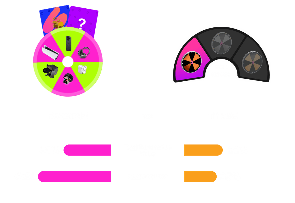
Reward Spinner
Scratch to reveal reward feature
We introduced the feature like they're used to
We launched the feature using a story-style format—familiar, swipe-friendly, and visually engaging. Since teens are already used to platforms like Instagram and Snapchat, this approach felt intuitive and non-intrusive.
It let us explain the feature in quick, digestible slides, reducing friction and increasing the chance they'd actually engage from the start.
THE RESULTS 📊
More teens were playing and earning rewards!
RewardZ ended up doing what TribeZ couldn’t—stick around. While TribeZ gave us a 22% boost in Total Transaction Value (TTV), RewardZ nudged that up to 31%. Even better, adoption almost doubled—from 35% to 65%. Turns out, giving teens individual control (and fun ways to spend their in-app currency) worked way better than asking them to organize a group project.
THE CONCLUSION 🚀
What I learned from this sprint
This project was a wild ride of experiments, conversations, and a lot of design-developer back-and-forths. But it left me with 3 strong takeaways.
When you're unsure—just talk to users. You'll probably get your answer faster than you expect. Don’t forget to loop in your engineers early, or you’ll end up redesigning your redesign. And lastly, when you're clear on the problem, your tools, and your boundaries—speed follows. I went from wireframes to flows to final screens faster than I thought possible.

The grind doesn't stop here!
Explore some of my other work and personal projects.

You can reach out to me at adesh169@pratt.edu
Copyright © 2024 Areen Deshmukh | Last updated April 2025


