Discovering Nakuru: Designing a More Intuitive & Engaging Tourism Experience for Nakuru Visitors and Residents
Usability Testing
Moderated Testing
User Interviews
Website

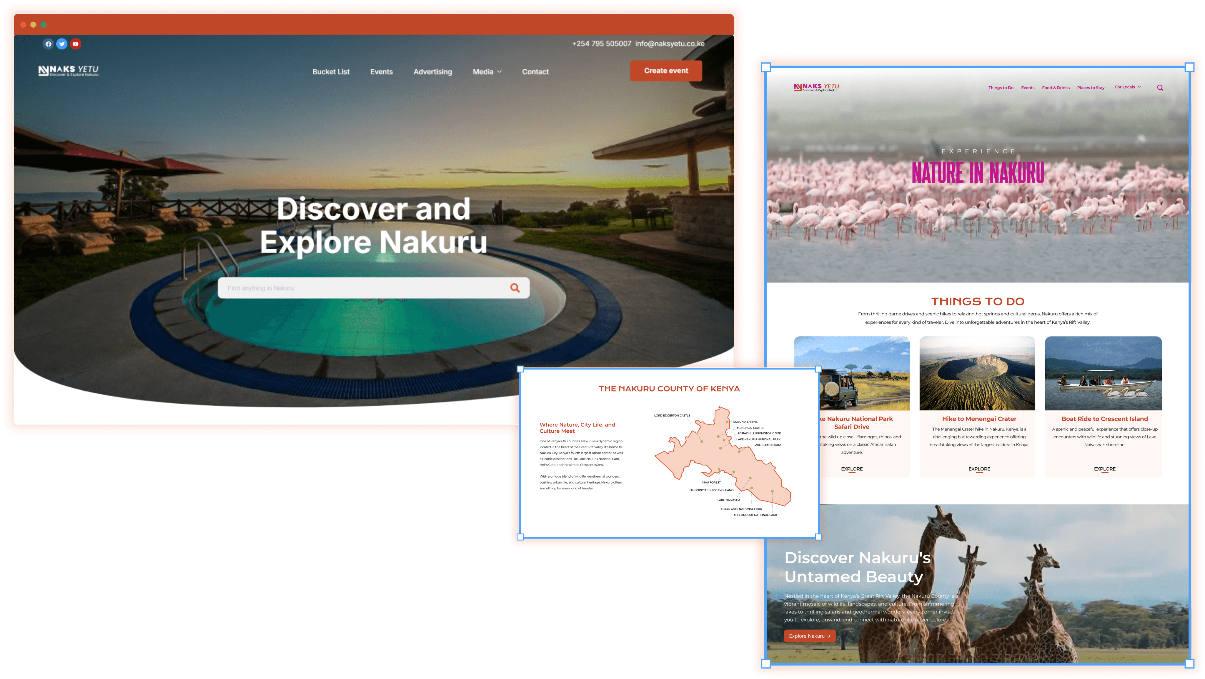
Naks Yetu is a digital platform that connects travelers and locals to the heart of Nakuru County, Kenya — highlighting authentic experiences, cultural richness, activities, and events tailored to both visitors and residents.
Role
Usability Testing
User Research
Research Report
Duration
Research: 3 weeks
Design: 1 week
Team
3 UX Consultants
Tools
Figma/FigJam
Panelfox
BACKGROUND
Our collaborators at Naks Yetu were interested in understanding how effectively their website communicates its purpose and supports key user actions such as discovering activities, attending events, and creating event listings.
We conducted a series of moderated usability tests with first-time users and proxy event organizers to identify areas of confusion and uncover opportunities to improve the experience.
Our recommendations focused on clarifying the website’s value proposition, enhancing event discoverability, simplifying the event creation process, and ensuring mobile-friendly navigation for on-the-go users.
“We want Naks Yetu to be that place where, if you want anything in Nakuru, you're able to get it.”
— Naks Yetu Stakeholder
UNDERSTANDING THE SCOPE
We kicked off the project with the Naks Yetu team by narrowing a broad vision into actionable goals for the website redesign.
With a broad vision, Naks Yetu sought to improve how locals and tourists explore Nakuru online.
We honed in on key flows — browsing activities & events, registering for events, event creation, and general navigation. This guided our understanding of pain points and foundational user needs for the redesign.
MODERATED USER TESTING
To gain insight into actual user experience, we designed and carried out 7 usability tests based on our defined goals for the sprint.
Our usability tests examined how potential tourists navigate key website flows within our scope — exploring general impressions, finding activities, registering for events, and creating events. We developed five realistic tasks, prepared pre- and post-study surveys, recruited participants through Panelfox, and moderated seven Zoom sessions.

We recruited adult participants who aligned with potential tourist use cases.
We recruited 7 individuals aged 21–30 via Panelfox. This age group was chosen as it aligns with the adventurous tourist persona we envisioned for Nakuru — tech-savvy travelers who typically research and plan their own vacations.
We relied on tourist participants as proxies due to challenges in recruiting local organizers.
One task involved testing the event creation flow for locals. Due to time zone differences and project constraints, we had tourist participants imagine they were hosting an event—allowing us to gather relevant insights.
FINDINGS
For many, the decision to travel begins with a digital detour through the destination.
While all 7 users found Nakuru exciting for a future getaway, they yearned for a richer, more vivid exploration of its experiences. While the current website gave a glimpse of Nakuru — participants wanted to immerse themselves into the details of every activity or event.
01
86% of participants couldn’t gain context on Nakuru, signaling a need for stronger storytelling on the homepage.
Participants described the site as a “resort page,” “travel agency,” or “event promotion blog,” indicating a lack of clarity in messaging.
Several users mistook the site for a resort, travel agency, or event blog—signaling unclear positioning
Terms like 'Nakuru' lacked context, leaving users unsure of the site's geographic or cultural focus
Homepage sections such as 'Bucket List' and buttons like 'Create Event' felt misaligned with user expectations
Users explored the site out of curiosity rather than guided intent, suggesting weak information architecture

02
78% of the participants did not find the information on the Bucket List page enough and wanted to know more details.
The site lacked clear calls-to-action, making it hard for users to know what to do next
Activity pages were missing key details and scannable summaries to support quick decision-making
Limited use of visuals or user-generated content reduced trust and engagement
There were no location indicators or map cues to help users understand where activities take place

03
71% of participants found the Media section lacking in authentic, relatable content from real visitors.
Users expected authentic content like reviews or vlogs but mostly found official videos
The term “Media” was unclear and didn’t match expectations for real visitor experiences

04
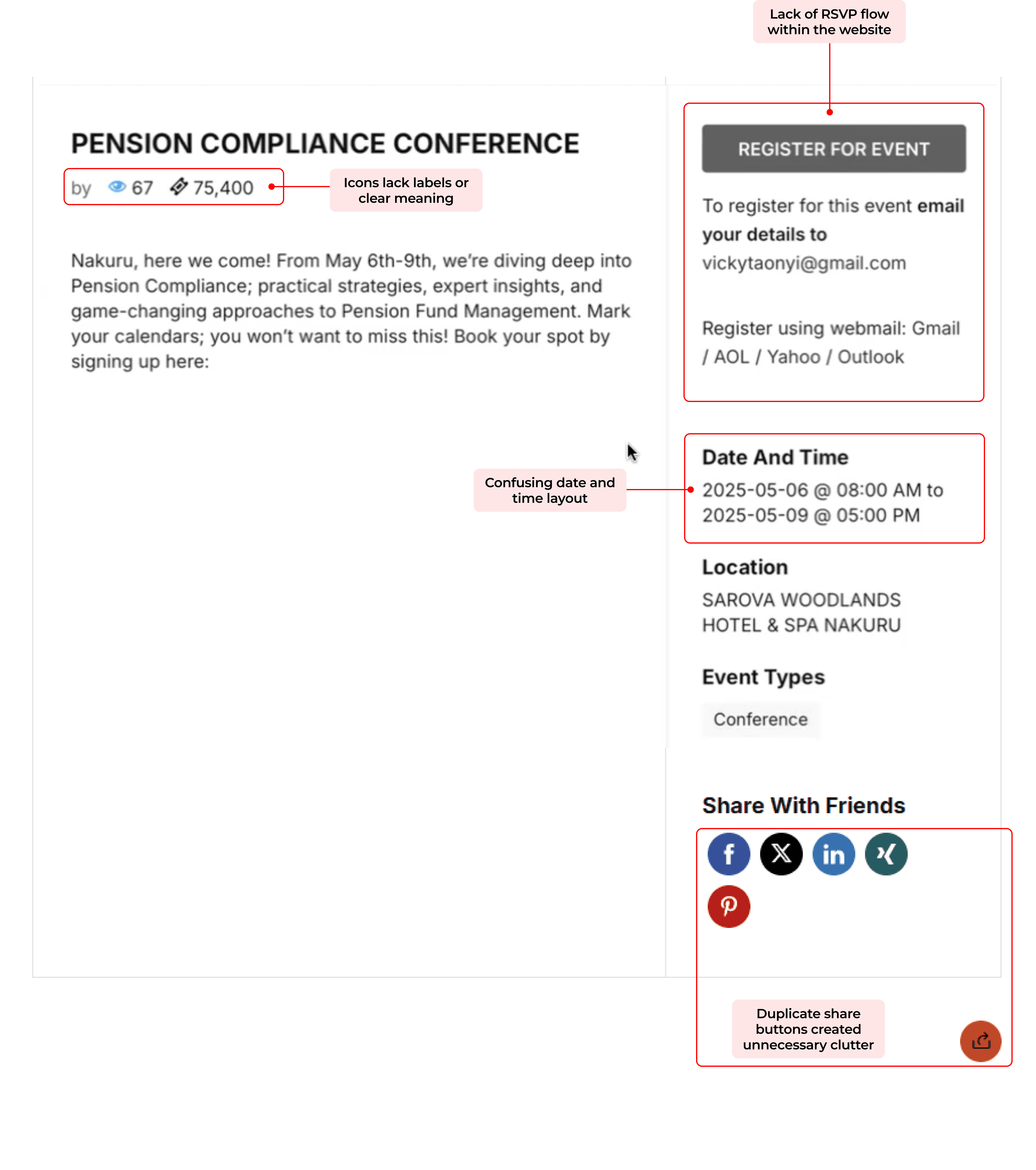
All 7 participants found the event registration process confusing, citing a lack of clear cues to guide their next steps or decision-making.
Unclear instructions on how to RSVP for events
Vague pricing information
Event date and time formatting caused confusion
Multiple share buttons cluttered the interface and added to user uncertainty
05
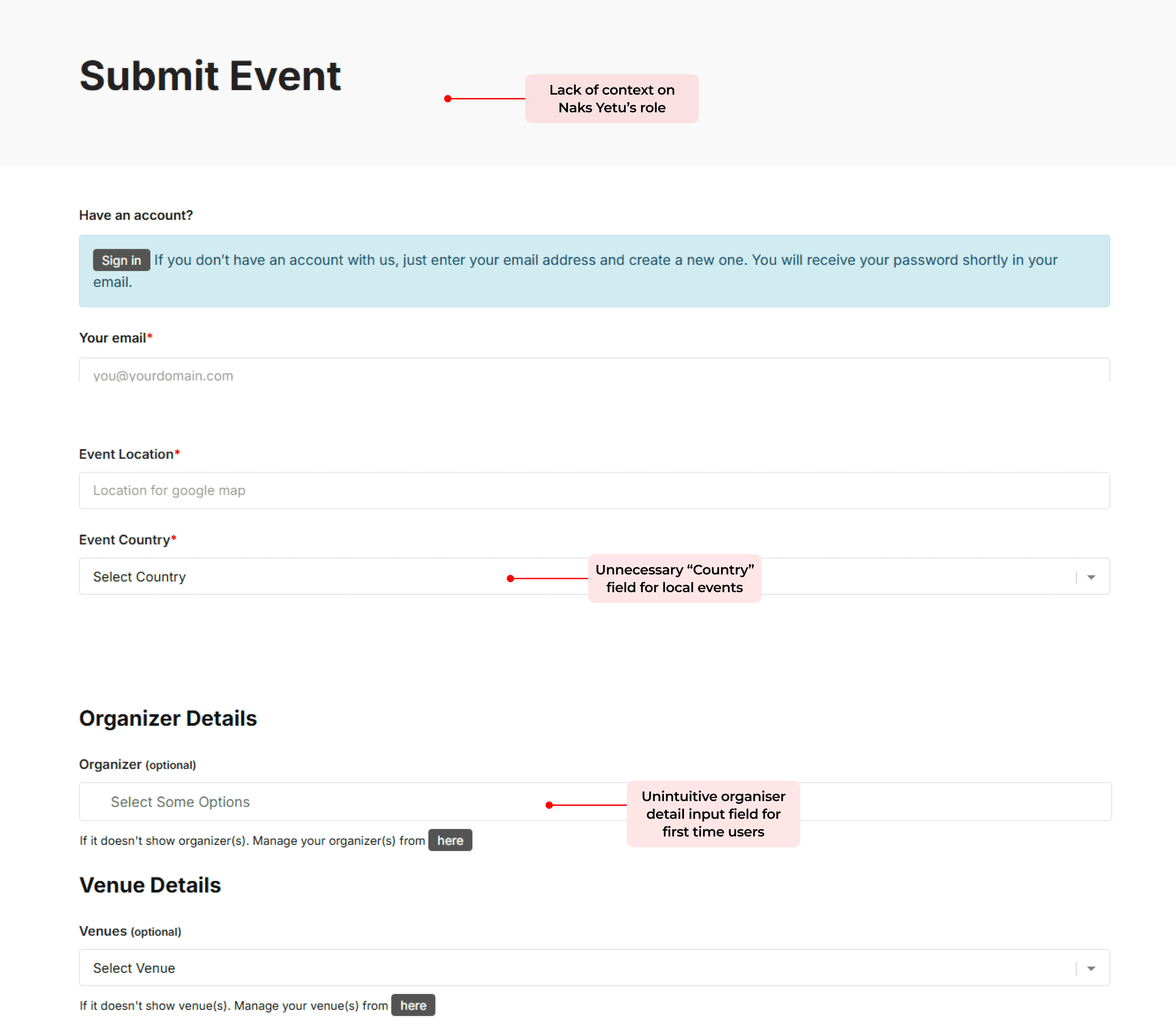
71% of users were confused by certain form fields and unsure about Naks Yetu’s role in creating events.
Several participants found the “Event Country” field unnecessary and confusing
Users were unclear about Naks Yetu’s role in event promotion or support
The event organiser field was not intuitive
OUR RECOMMENDATIONS
01
Improve Homepage Communication by Highlighting Nakuru’s Identity and Key Attractions
Revise navigation bar to include relevant menu items and provide a separate gateway to locals
Introduce section providing context on Nakuru as one of Kenya's county
Improve the messaging and visuals around activities
Add relevant sections like ‘Places to Stay’ and ‘Tour Packages’ to help users explore Nakuru as a tourist destination
Add a social media content section on the homepage to increase engagement


02
Enhance ‘Bucket List’ Pages with visual tags, icons, and action buttons to support informed user choices
Rename 'Bucket List' as 'Things to Do' to match user expectations
Incorporate photo and video galleries to build interest and trust
Present key info using summaries, visual tags, and clear call-to-action buttons
Embed Google Maps to provide location context and directions

03
Incorporate engaging media to support user exploration and build trust through real experiences
Rename 'Media' to 'Video Hub' to better set content expectations
Feature short-form videos in a 'See Adventures from Others' section with embedded social content (TikTok, Reels, YouTube Shorts)
Separated Naks Yetu-related videos in a subsequent section

04
Enhance the event page that helps decision-making
Add a clear RSVP option under each event to guide registration
Show ticket prices in Kenyan Shillings (KES) to build credibility
Replace “views” with “seats available” to convey event capacity
Change “Register” to “Contact Info” for organizer follow-ups
Standardize date and time format for clarity
Remove duplicate share buttons to reduce visual clutter

05
Reduce friction in event submission by simplifying organizer details and removing unnecessary fields
Remove the “Event Country” field since all events are based in Kenya
Add a short intro message explaining the form’s purpose and that posting is free
Use placeholder text to guide users through specific fields (e.g., organizer, health guidelines)
Clarify Naks Yetu’s role in event promotion at the top of the form


CONCLUSION
Our testing revealed that users needed clearer guidance on what Naks Yetu offers, more actionable activity listings, easier event registration, and authentic content to build trust.
While users were excited by the platform’s goal of showcasing Nakuru’s culture and experiences, gaps in clarity, structure, and interactivity held it back from reaching its full potential.
The client expressed enthusiasm for the recommendations, sharing that they now had “a clear direction as to what we need.”
They appreciated the prioritization of short- and long-term changes, especially ahead of the tourism season, and were excited to begin implementing updates step by step.
“We were confused on how to go about to redesigning the website, and now we have a clear way forward!"
— Naks Yetu Stakeholder
NEXT STEPS
The Naks Yetu team will be creating a new website using the designs provided by our team.
The Pratt team remains available to support Naks Yetu with any clarifications during their redesign process. We’re excited to see how they bring Nakuru’s rich culture and experiences to life through their updated platform — and we look forward to seeing the final result!
SPECIAL APPRECIATION
The redesign of the navigation bar to incorporate a gateway for locals was the most well-received recommendation.
“My favourite section is how you separated the international tourists and locals [with the navigation]. This helps us build a foundation of how we can expand [the offerings]"
— Naks Yetu Stakeholder
IF WE HAD MORE TIME (& a scope beyond usability)
Create complete flows for new sections
New sections recommended as part of the new design such as 'Places to Stay', 'Food & Drinks', 'Tour Packages' — would require respective information architecture and user flows
Add complete flows for Local users
While the navigation bar incoproates a dropdown that lists the sections relevant for locals, such as — 'Local Events' , 'Advertising', 'Create Event' — these sections, too, warrant a complete design flow.
Create a design system for the redesign
While our redesign uses a specific design — it is mainly for the purpose of representation. Given the goal of the project being around usability issues — the team decided not to spend too much time on designing a design system.
To shaping a platform that honors Nakuru’s richness, one meaningful interaction at a time!
You can reach out to me at areen.skd@gmail.com
Copyright © 2025 Areen Deshmukh | Last updated May 2025


